
Sun soaked and saturated this August
Posted in Colour Stories, Interior Design

August in the BVI does not do subtlety. The heat is full on and with the current haze of Sahara dust the horizons look almost white with everything left standing in it holding its own against the glare. Pale washes out therefore August should be saturated: The argument for this month’s colour palette suggestion.

We have spent a season easing into warm neutrals, soft coral stone and quiet, bleached-out restraint and don’t misunderstand me, we still love calm and look for it for solace from the heat. However, August suggests the opposite. Sun-baked and saturated is ochres, pushed close to its limit, terracotta with real weight to it, driftwood grays to keep it grounded and a cream that reads more like raw canvas than beach-house white. It is louder for the sake of it and because that is what actually holds up in this light.
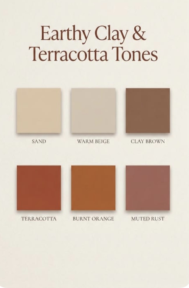

There is a temptation when decorating for the tropics to think heat calls for heat inside and that white walls, bleached wood set against a colour makes a room feel warmer than it already is. In practice, the opposite tends to be true. A clean palette can work well with the some saturated sun soaked colors. Ochre and terracotta, by contrast meet the sun rather than surrender to it. They are drawn from clay from sun-dried earth from the actual ground colour of the islands under all that heat – so they do not fight the light they extend it indoors.

This is not a palette for every wall. Used well, it lives in the pieces that are meant to hold attention – a single terracotta chair against a driftwood-grey floor, an ochre linen runner down the centre of an otherwise quiet table.

A stack of raw-cream ceramics that look like they were pulled straight from a kiln. Let one saturated note anchor a room and keep everything around it plainer than usual. that contrast is what makes August colour feel considered rather than costume-y
image
It also happens to be where the wider design world is heading this year, though we would rather claim we got there by looking at our own island palette than by watching a trend report. Ochre and burnt clay are turning up in the interiors everywhere just now. Ours simply come with better excuses – they are the colour of the ground here in august, baked and unapologetic and they have been for a great deal longer than the trend has existed.

Blue will be back by September, the way it always is but for one month, we would rather build a room around the colour of the heat itself
If you are looking for any help or inspiration with your interior product, don’t hesitate to contact us on [email protected] or call 284-5421964
Fran x