Interior Design
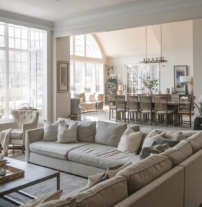
The Art is Enough – Decorating with Minimalist Harmony in Tropical Homes
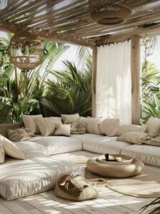
There is a particular kind of calm that settles into a room when nothing is competing for your attention. No shelf overloaded with ornaments, no clashing patterns pulling the eye in six directions at once. Just space, light, and a handful of things that genuinely belong. That quiet — warm, unhurried, deeply liveable space— is…
Read More about The Art is Enough – Decorating with Minimalist Harmony in Tropical HomesDecorating with a splash of colour
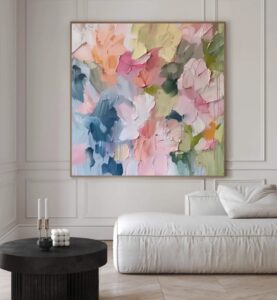
Adding splashes of colour to your home is one of the simplest and most effective ways to transform a space. At House, we believe that even the most neutral interiors can come alive with carefully chosen pops of colour. Whether you live in a beachfront villa or a cosy apartment, strategic use of colour can…
Read More about Decorating with a splash of colourDecorating with Coastal Greens
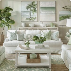
At House, we’re constantly inspired by the natural beauty of island living. From palm-lined beaches, sea grapes trees and lush hillsides sliding to meet the sea, green is a woven into the coastal landscape around us. It’s a colour that feels effortless and grounding, making it a natural choice for interiors designed to reflect a…
Read More about Decorating with Coastal GreensEmbracing the Benjamin Moore colour of the year for 2026 – Silhouette The trendy of earth tones is well and truly upon us!
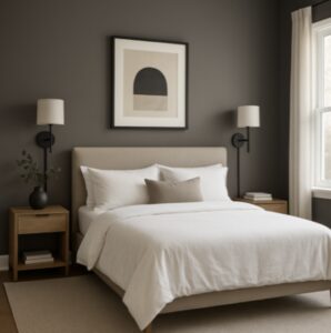
At House Interiors, we continually look for colours that feel grounded yet elegant—tones that work in harmony with our sunny surroundings rather than competing with outdoor views. Benjamin Moore’s Silhouette is one of those rare shades. A soft, smoky neutral with warm undertones, that offers a sophisticated alternative to and in conjunction with white while…
Read More about Embracing the Benjamin Moore colour of the year for 2026 – Silhouette The trendy of earth tones is well and truly upon us!15 Styling tricks that will instantly elevate any room
It’s September and I always feel like its time to spruce up the room without embarking on a full renovation. Sometimes it’s not about what you change, but how you style what’s already the space. These 15 simple but powerful tricks can instantly elevate any room, no matter your budget or square footage. Try to…
Read More about 15 Styling tricks that will instantly elevate any roomGot The Blues? How to create a calm, relaxing colour scheme for your home.
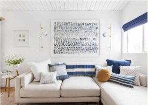
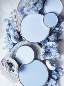
Blue is our featured colour for design inspiration for July. Those of you who follow us on social media or read our blog, know how much we all love blue at house but Its been over 5 years since I have directly written about decorating with blues to create a calm, relaxing space, so….. here…
Read More about Got The Blues? How to create a calm, relaxing colour scheme for your home.Fresh, Serene, and Timeless: Decorating with a Green and White Palette
When it comes to interior design, few colour combinations evoke a sense of calm and sophistication quite like green and white. Whether you’re aiming for a crisp modern look or a cozy natural vibe, this duo offers incredible versatility. From minimalist aesthetics to lush botanical themes, decorating with a green and white palette is a…
Read More about Fresh, Serene, and Timeless: Decorating with a Green and White PaletteWe love Orange
Orange is a colour that for me, inspires warmth, energy, and happiness. It’s the perfect choice for infusing life and spark into a neutral palette without overwhelming it. Although there are many different shades of orange, from soft peach to bold tangerine, that evoke various moods, for this piece I’m talking flashes of more vibrant…
Read More about We love OrangeEmbracing Coastal Elegance: Decorating with Beachy Beiges and Wispy Whites.
When it comes to creating a serene and inviting atmosphere in your home, few colour palettes evoke the tranquil and relaxed feel of “Coastal Living” quite like beachy beige and white. These shades are reminiscent of sandy beaches and ocean side homes and can transform your space into a peaceful retreat. For island living on…
Read More about Embracing Coastal Elegance: Decorating with Beachy Beiges and Wispy Whites.Modern Tropical Decor (If its colour you are after, look away now)
If you are dreaming of a home that embodies the lushness of a tropical paradise while maintaining a sleek, modern aesthetic, look no further than Modern Tropical Style. This design approach harmoniously blends lush green colours and natural elements of tropical decor with clean lines and contemporary furnishings. This style is absolutely perfect and fitting…
Read More about Modern Tropical Decor (If its colour you are after, look away now)
