Why to use Orange.
Posted in Colour Stories, Interior Design
This months homage to colour celebrates the vibrancy of orange. Its not an obviousl colour to decorate with but used carefully and stylishly, it is beautiful and bold, warming and welcoming. I find it sneaking into my schemes all the time and when you are in the shop, you will notice it too.
The colour orange denotes feelings of liveliness, motivation and happiness. It is the colour of creativity , joy and enthusiasm. It provides a general sense of wellness and is good for emotional balance. Also said to promote harmony, passion, freedom, intuition, expression and sexuality so whats not to love??
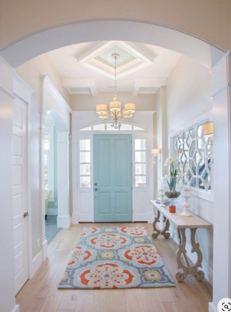
Orange is a versatile colour. Set against a cool back drop of turquoise it adds a slick update to a quieter colour scheme
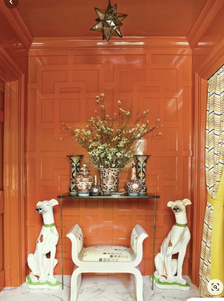
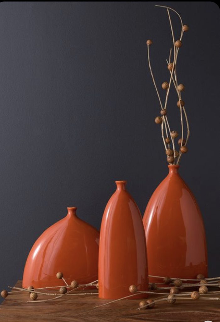
Orange certainly can heighten the drama in a room – from total saturation…
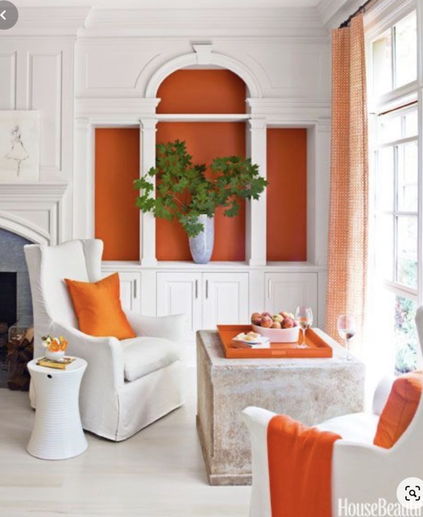
…to a burst of colour against a monochromatic scheme. See below
It is often mis-understood and dismissed but used correctly, just a small pop of this colour in a room can make a huge difference.

Cindy Winter designs
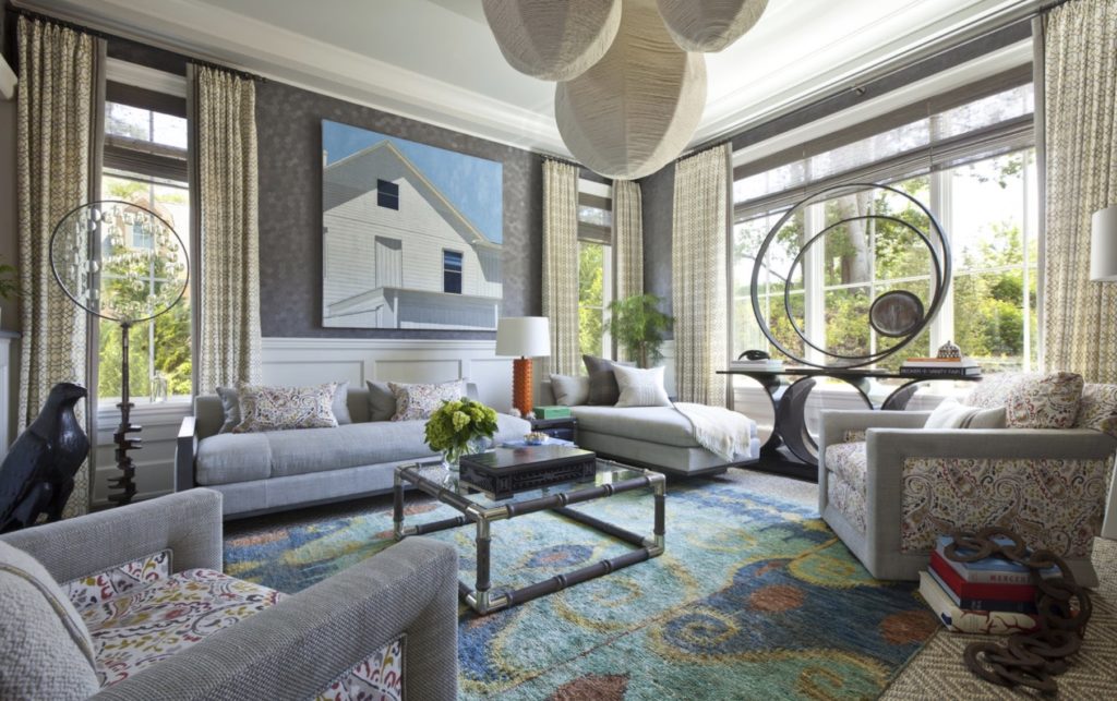
Oceanic inspiration. A rug with blues, greens, and oranges offer a seascape-inspired environment. Thom Filica Inc

Towels and rug add interest to this monochrome bathroom
Maria Haidamus Interiors
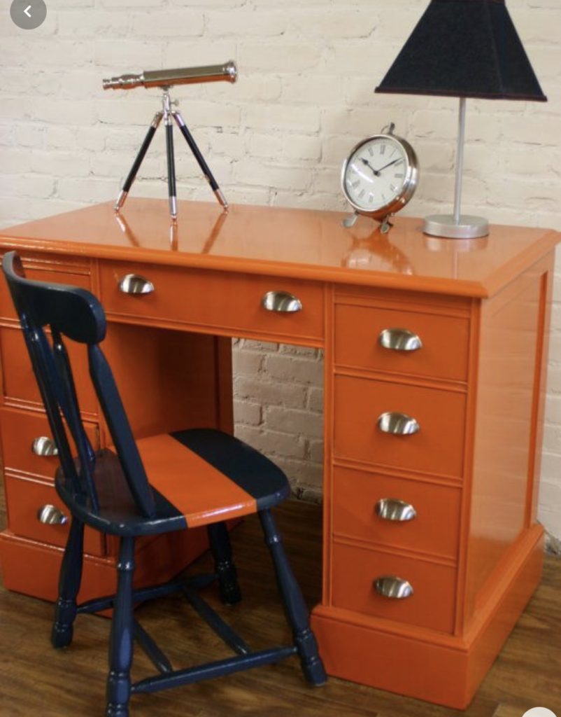
If afraid to use on walls, ceilings or floors, why not use as an accent. This colour looks amazing against navy or dark grey.
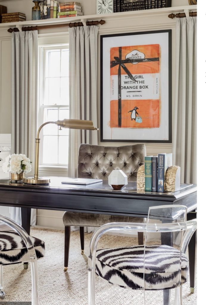
Introduce colour through artwork in an otherwise neutral space.
Robin Gannon Interiors
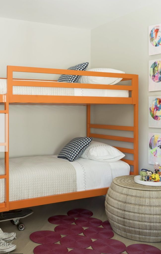
If you cannot find what you want in furniture pieces, don’t hesitate to get out the paint brush and paint a piece (or pieces of furniture) you already own. Watch our instagram page this month for our ‘One of a kind’ series that we are promoting in store.
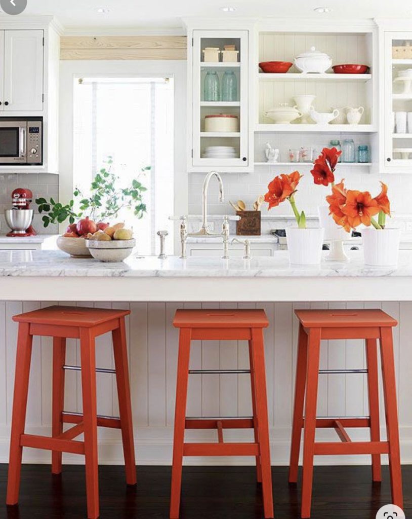
Simple bed frame updated for a Childs room Repeat colour in kitchen accents for seating Whimsical desk updated with orange paint
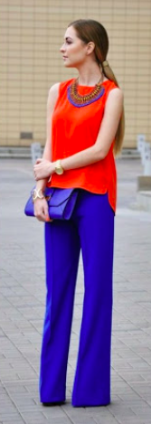
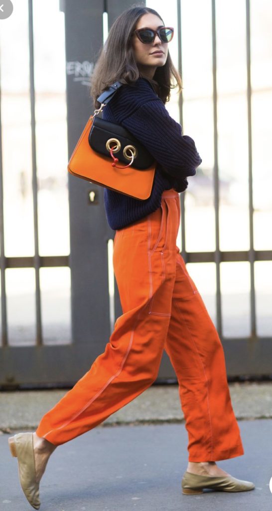
As usual, I like to close with a nod to fashion. I love to wear a splash of orange (and not much other colour in general). My nails are only ever painted a coral orange and of course orange is the colour of Hermes. What more can be said……
Fran Morrell