Island Blues: Why this colour palette simply works in the Caribbean
Posted in Colour Stories, Interior Design
There is a reason you never get tired of staring at the views here. The Caribbean Sea does something to you. It shifts between navy and indigo at dawn, softens into a shimmering aqua by midday, and then deepens into something almost violet as the sun drops. Living with that view — or even simply living in proximity to it — changes how you think about colour inside your home.
This month (late I know) I want to talk about island blues. Not the clichéd nautical stripe or the beach house clichés of anchor prints and rope accessories. I mean the considered, intelligent use of blue tones that are inspired by our beautiful natural environment and that translate into spaces that feel genuinely elegant and calm.
Why Blue Works Here
Blue is perhaps the most psychologically powerful colour in the designer’s palette. It lowers the heart rate, reduces anxiety, and promotes a sense of spaciousness. In a tropical climate, where heat and humidity are constants, that psychological cooling effect is enormously valuable. A room washed in the right blue simply feels cooler — and that is not a trick of the mind, it is a well-documented response.
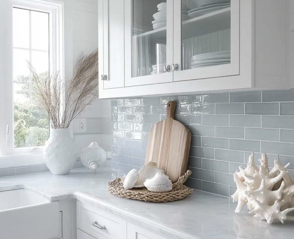
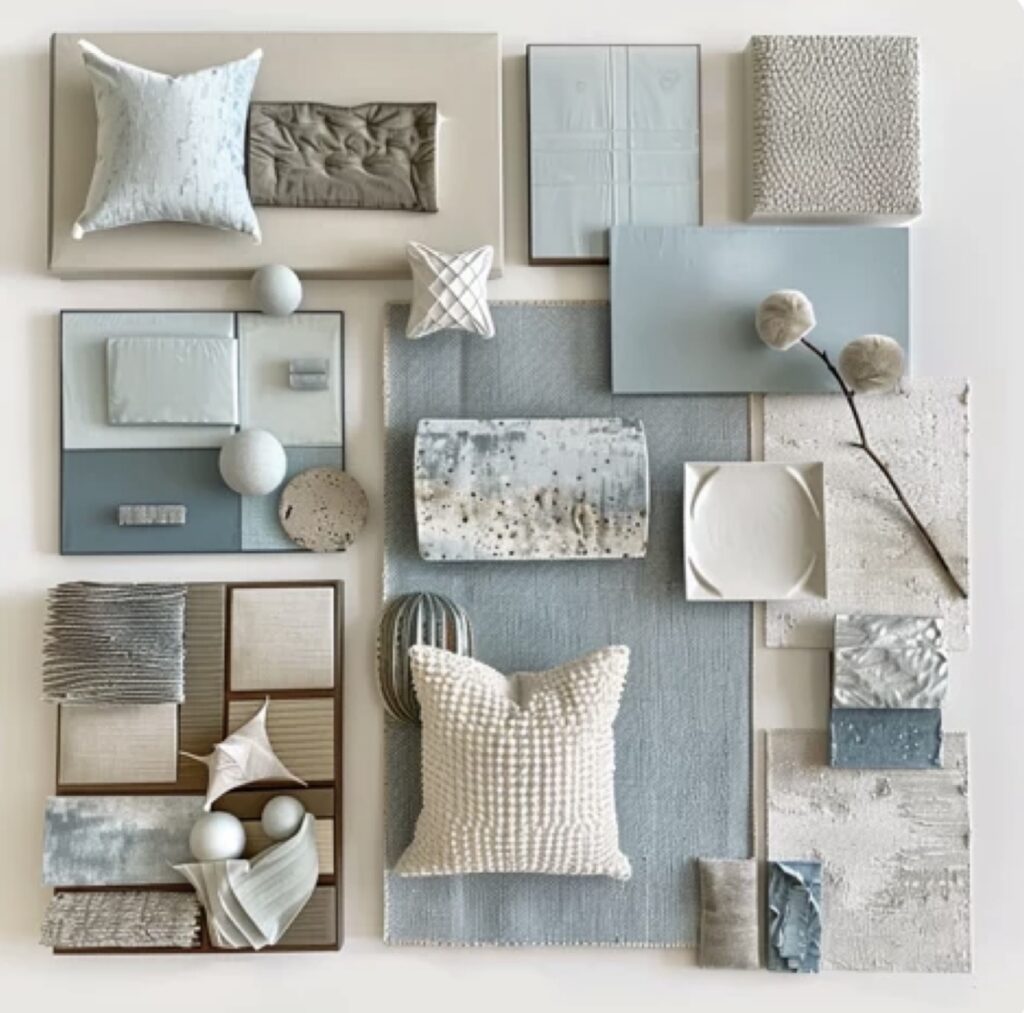
But not all blues are created equal, and this is where the Caribbean context matters. We are not decorating a Scandinavian apartment or a London living room. Our light is intense and directional. It bleaches weak colours and deepens saturated ones. The blues that work best here are those with warmth in their undertone — dusty blues, soft denim tones, watery greiges that tip towards teal, and the muted, chalky aquas that echo seaglass washed up on the shore.
A Modern Approach
The mistake many people make when working with island blues is defaulting to a traditional or coastal aesthetic — beachy, rustic, casual. And while there is nothing wrong with that, the real opportunity is in going modern with it.
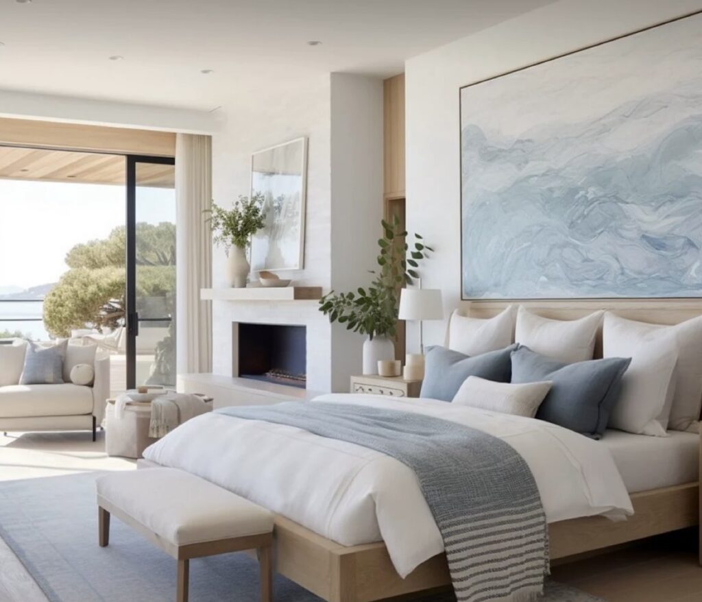
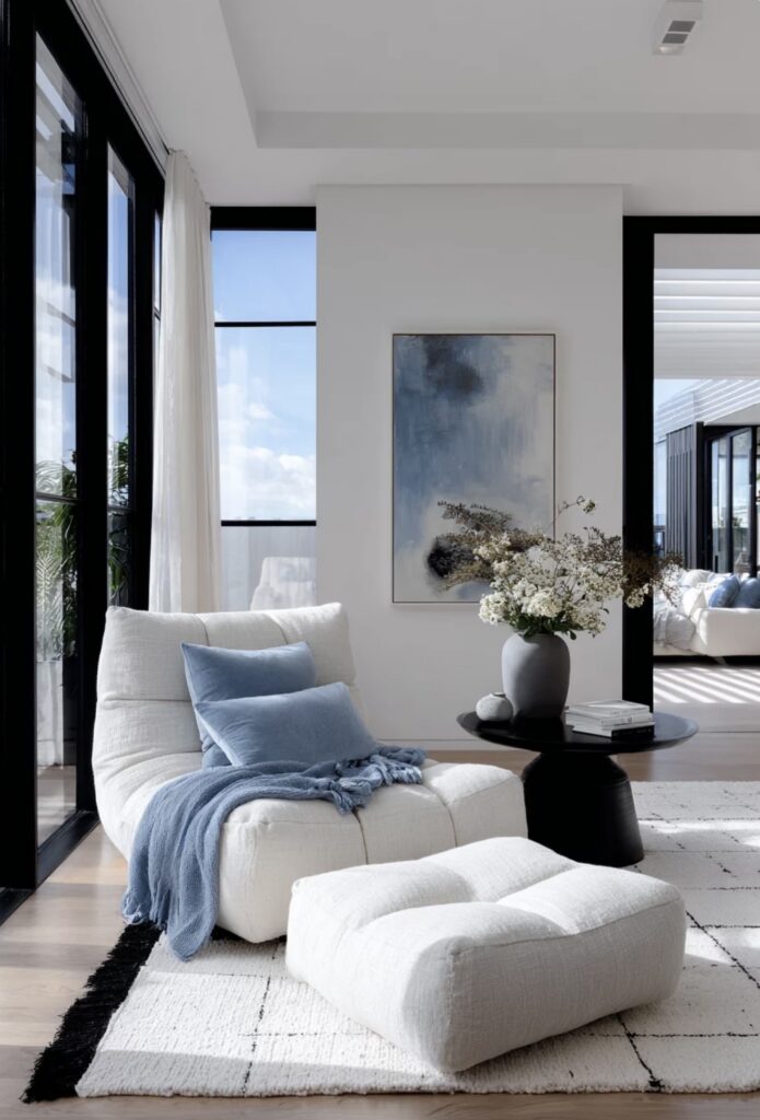
Think clean-lined furniture in natural linen or performance fabric, paired with walls in a sophisticated muted blue — something like a faded indigo or a soft slate. Introduce texture through rattan or woven pendants, but keep the silhouettes simple and uncluttered. The contrast between the organic and the architectural is what gives a modern island interior its tension and interest.
A modern palette might layer a dusty blue wall with warm white woodwork, a bleached oak floor, and accents in aged brass or matte black. The result feels grounded and contemporary whilst still being entirely of this place. It does not shout “beach house.” It whispers it.

Working with the Light
Always test your blues in situ and at different times of day. Morning light in the BVI has a golden quality that will warm a blue considerably, whilst the flat white light of midday can make the same shade feel almost grey. The late afternoon, when the light turns amber, is when many blues come into their most beautiful — suddenly rich, saturated, and impossibly inviting.
If you are uncertain where to start, a softer aqua or chalky blue-grey is always a reliable foundation. Build from there: deeper cushion tones, blue-green ceramics, a statement piece of artwork that anchors the room.
The sea has been decorating these islands for millennia. The least we can do is take the hint.