Colour Stories and how we interpret them in our interiors.
Posted in Colour Stories
Pantone is the standardized colour matching system for identifying colours. For over ten years, The Pantone Colour Institute has issued “The Colour of the Year” as a trendsetting concept for branding, marketing and the creative society as a whole.
Hundreds of brands, then take on the task of designing products using the same colour which re-enforces the importance of how the colour trend is incorporated and shows the influence this holds.
Colour Predictions for 2021
Colour is paramount to the design of a room. If the hue is wrong – everything else will be out of balance and can appear off kilter. Its an intensely personal choice. Colour is what you interact with on a daily basis, what you wear, how you choose to surround yourself and can encourage moods and set the tone for how you feel and the type of space you are enjoying.
For interiors, the paint companies’ colour choices act as a guide to help customers know what is out there in the market place. Paint companies also devote a whole year to translating trends into home accents and picking a selection yearly and introducing the “in” colour for the coming twelve months. It is interesting to see how varied these predictions and choices are: from Pantone, Benjamin Moore, Sherwin Williams and Farrow and Ball.
Paint companies pick yearly colours as it helps to sell paint. New introductions of special colours or hues gives ideas as to how to revive your home.
Farrow and Ball Paints:
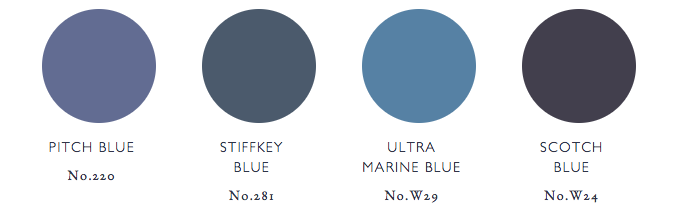
Charlotte Crosby from Farrow and Ball agrees that traveling is key, but different nations have different relationships to colour. For example, in China the colour red means good luck, but in the west red often represents danger so that needs to be born in mind when picking final choices.
Sherwin Williams:
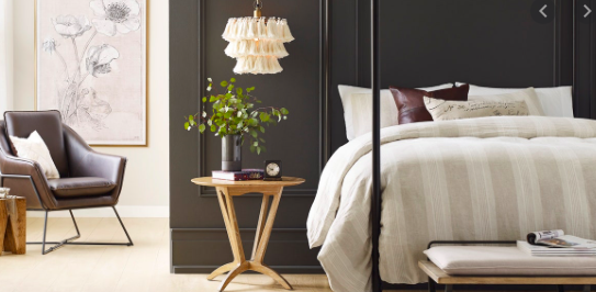
Benjamin Moore:
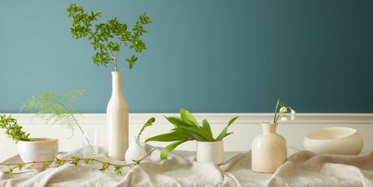
We decided to use Aegean Blue as a re-fresh in our bathroom at work, though I would hesitate to use this colour, in a large room in the Caribbean, I have seen it used successfully on molding and shutters. It looks better paired with white or ivory as below.
Andrea Magno of Benjamin Moore explains that months of research, traveling to design shows and interesting destinations provides cues and influences from different industries and points of view eg fashion, art and design. All the research is assimilated and collated and influencers try to find a common thread from what they have seen until a final colour is decided upon.
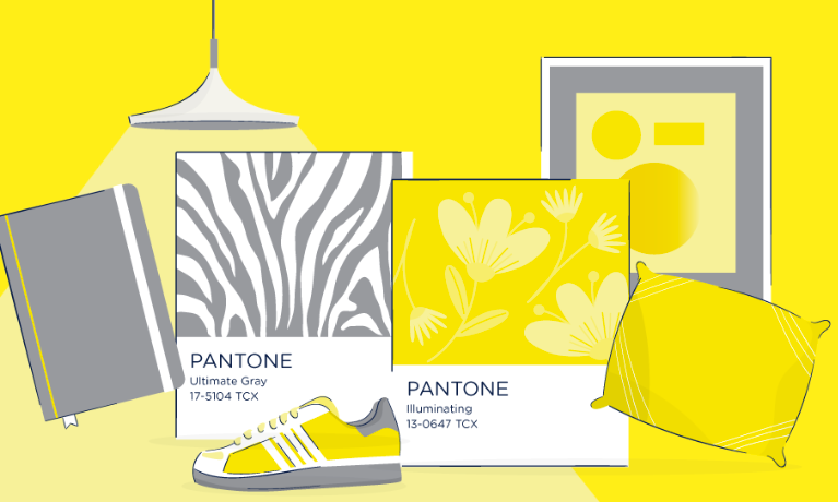
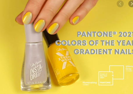
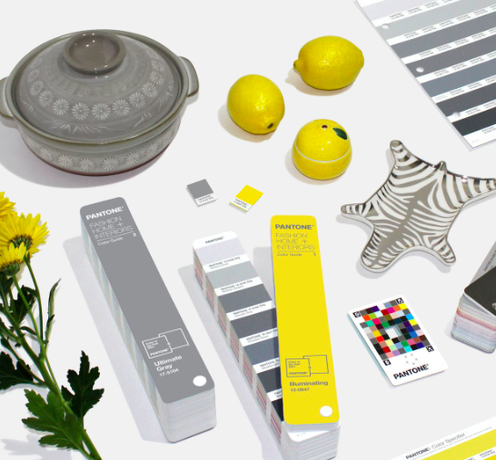
Pantone Colour(s) of the year for 2021
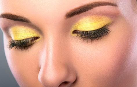
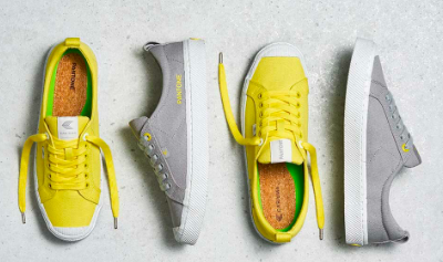
Below shows examples of how brands interpret trends so we use them in our daily lives:
Make up
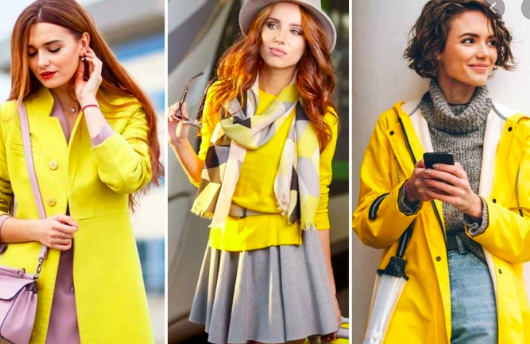
Fashion
Decorative accessories
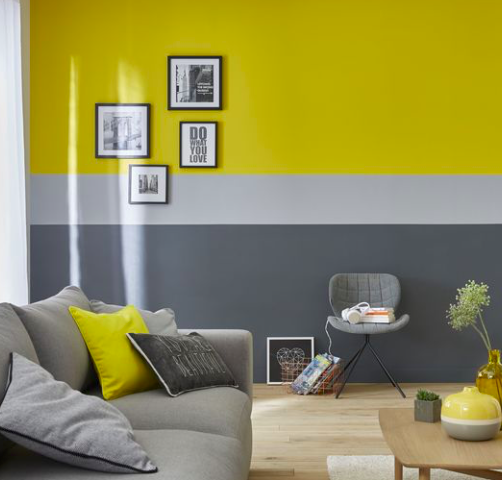
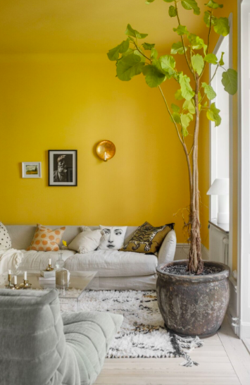
Interior Design
Colour trends change drastically from year to year. Aubergine to Aquas, to last years Classic Blue and this years Yellow and Grey.
We have chosen to incorporate these colours as decorative accessories, kitchen accessories and soft furnishings at House and we look forward to sharing these with you in the coming weeks.
Rather than running from a palette we may not necessarily have picked for ourselves, we have pivoted and used it to freshen up our in store offering. You may not realize, but you will have seen these colours on line, in fashion blogs and becoming available in everyday items you buy so eventually, you too will adopt the pieces and be influenced with what you buy for your home or wardrobe. Due to the influence that Pantone exert, it is not a problem finding items from our suppliers who have in turn been directed down this colorful road.
We look forward to showing you our new curated collection of items and please do not hesitate to contacts for colour advice or choices.
Fran