House BVI Design By Fran Morrell

News and articles about elegant island interior decorating and design. Turning your house into a home.
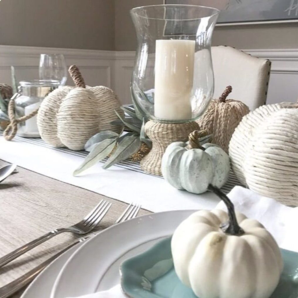
dining-table-staging

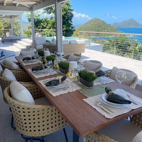
Staging Project For Villa Rental Market

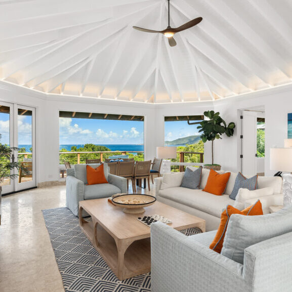
We have had a busy week styling two villas for a shoot for the rental market and a big shout out to Coldwell Banker for these two new villas that are fantastic.

kitchen-makeover-after

Kitchen Makeover – A simple Solution

To continue our conversation regarding our most recent blog, “The Importance of Staging” I thought it’s interesting to see the before and after of a dated wooden kitchen given a painted make-over – lifting the overall look and feel of the property.  See the after picture below……The biggest bonus is that the countertop no longer…

After image for staging a home with cool colours

The Art of Staging a Property

The importance of staging a property is crucial and cannot be understated as it can significantly impact the selling process and the final sale price of your house or increase the rental opportunity potential. Properly considered staging involves preparing and presenting the spaces in a way that appeals to potential buyers or renters allowing viewers…

Screen-Shot-2022-02-01-at-4.34.12-PM

How to decorate in 2022

Benjamin Moore Paints have announced their colour of the year for 2022. Earlier House blogs explain how yearly trend colours are chosen. (Read here) https://housebvi.com/colour-stories-and-how-we-interpret-them-in-our-interiors/ Due to pandemic restrictions over recent years, travel became difficult, therefore virtual pin boards were used more than physical mood boards with online colour consults between decision makers. The colour…

Screen Shot 2022-01-27 at 1.48.35 PM

New items arriving early February 2022

New finds arriving in store for February

Screen-Shot-2021-02-28-at-11.45.47-AM

Colour Stories and how we interpret them in our interiors.

Pantone is the standardized colour matching system for identifying colours.  For over ten years, The Pantone Colour Institute has issued “The Colour of the Year” as a trendsetting concept for branding, marketing and the creative society as a whole. Hundreds of brands, then take on the task of designing products using the same colour which…

Screen-Shot-2020-11-15-at-4.30.24-PM

50 Shades of White

What is White? If you research the meanings and explanations for white the lists and representations that are available are numerous. White is said to symbolize positivity. It is associated with purity, innocence, light, goodness, safety, brilliance, illumination, understanding, cleanliness, beginnings, spirituality, possibility, humility, sincerity, and protection! The list is long. I personally feel that…

IMG_7058

Why to use Orange.

This months homage to colour celebrates the vibrancy of orange. Its not an obviousl colour to decorate with but used carefully and stylishly, it is beautiful and bold, warming and welcoming. I find it sneaking into my schemes all the time and when you are in the shop, you will notice it too. The colour…

IMG_6881

Blue and Green – A colour story for September

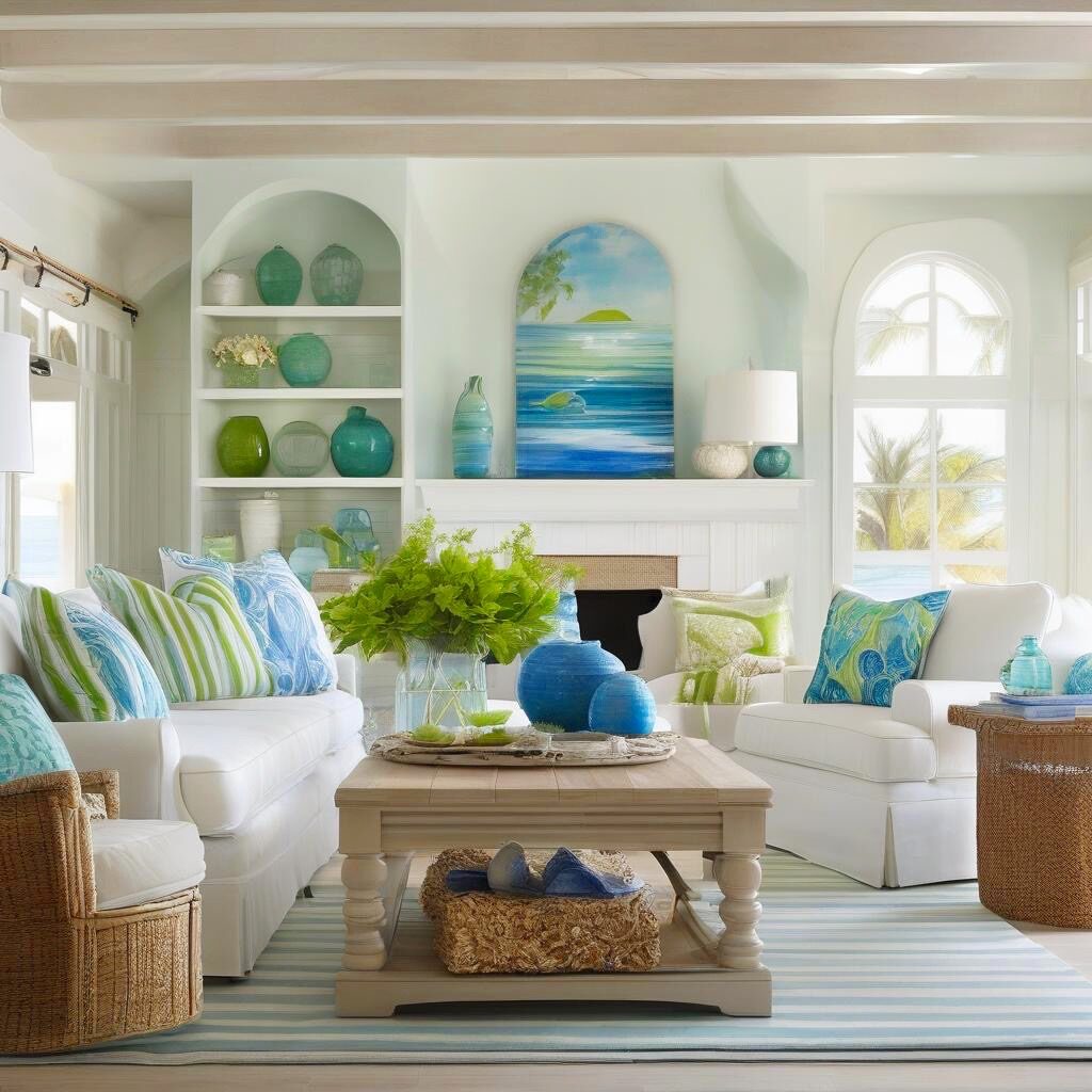
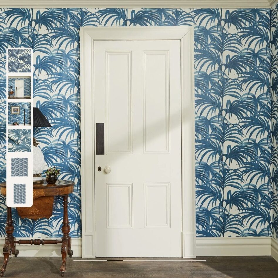
“Blue and green should never be seen without a colour in-between”. This is an old fashioned saying and one with which I totally disagree. I think that these two cool colours that sit together in the colour wheel (an analogous colour scheme) work fabulously together and we frequently use these colours together in our design…

B7061A81-C888-45BC-A32C-8F49F89755EB

August Aquas

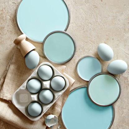
This month I want to talk about the colour aqua, both used as a back drop and an accent. Aqua is described as refreshing and uplifting. It is considered a colour of creativity, light hearted but tranquil. It inspires, calms, balances both the mind and emotion and is said to promote inner peace and serenity.…