Posts by housebvi
Salt and Stone – a colourway for slower Caribbean living
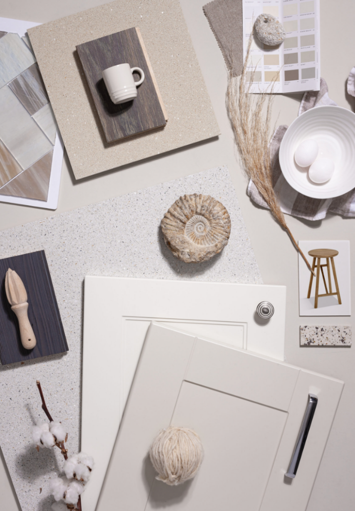
Smokey taupes, bleached coral stone, warm linen white and a touch of aged brass. There is a particular hour in the Caribbean, when the sun starts to set and the light turns everything the colour of warm limestone. Walk away from the shoreline for five minutes and the blue story changes — into smoky taupe…
Read MoreIsland Blues: Why this colour palette simply works in the Caribbean
There is a reason you never get tired of staring at the views here. The Caribbean Sea does something to you. It shifts between navy and indigo at dawn, softens into a shimmering aqua by midday, and then deepens into something almost violet as the sun drops. Living with that view — or even simply…
Read MoreDecorating with Coastal Greens
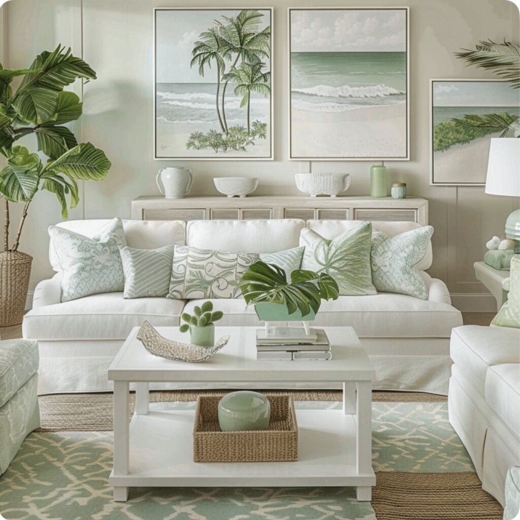
At House, we’re constantly inspired by the natural beauty of island living. From palm-lined beaches, sea grapes trees and lush hillsides sliding to meet the sea, green is a woven into the coastal landscape around us. It’s a colour that feels effortless and grounding, making it a natural choice for interiors designed to reflect a…
Read MoreDecorating with Blue Nova 825
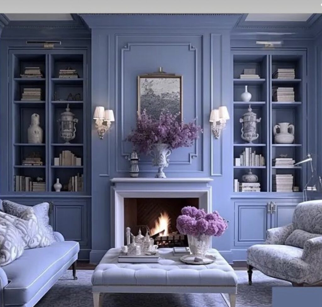
When it comes to decorating a space, choosing the right colour can truly make or break the overall aesthetic. Benjamin Moore’s 2024 colour of the year is the most perfect blue – Blue Nova. This deep, rich Caribbean blue hue has a sense of sophistication and elegance that will instantly elevate any room. As we…
Read MoreDecorating with Island Inspired Aquas
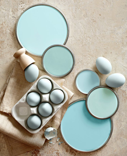
Soft coastal aquas blend beautiful and calming colours with neutrals that can be used to create a serene and peaceful atmosphere in any room. From Sea Glass hues and gentle wall paints, aqua inspiration is ideal for a Caribbean scheme.
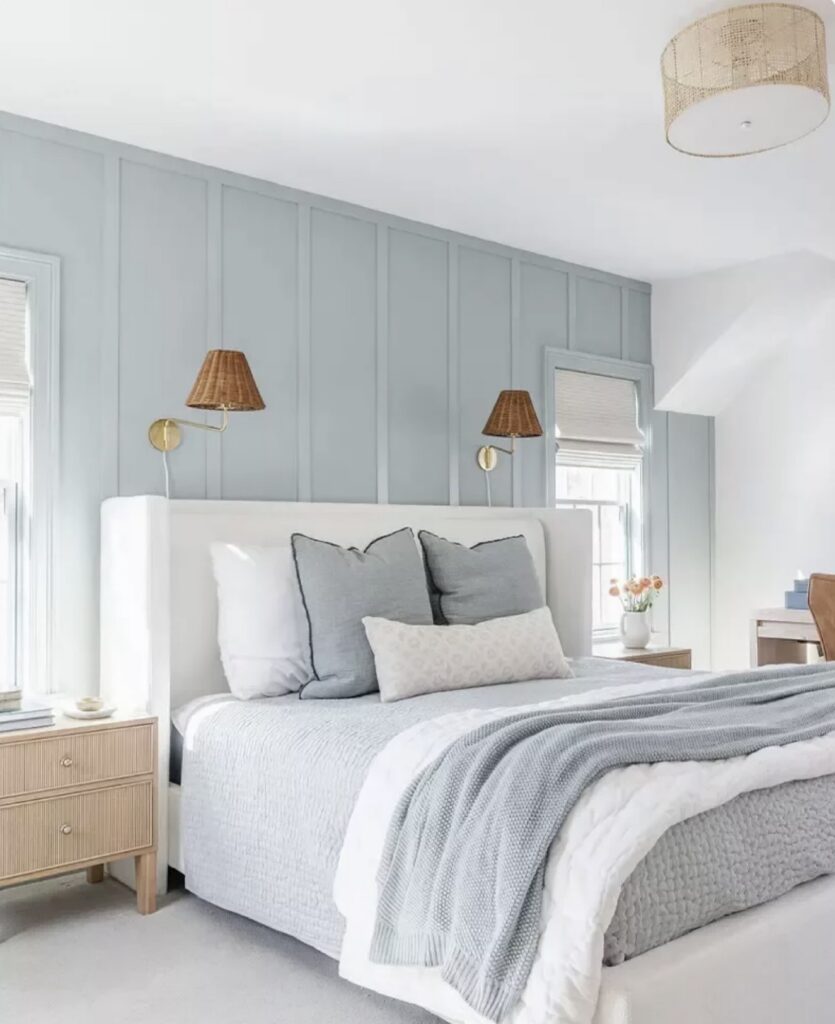
Read MoreDesigning Calm Coastal Bedrooms
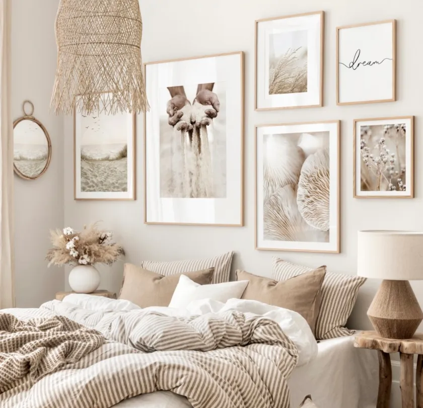
When it comes to creating a cool and relaxing coastal bedroom, beige monotone hues are the perfect choice. Naturals, beiges and whites are versatile colours that evoke a sense of tranquility and comfort, making them an ideal choice for a bedroom that is meant to be a peaceful retreat.
Read MoreKitchen Makeover – A simple Solution
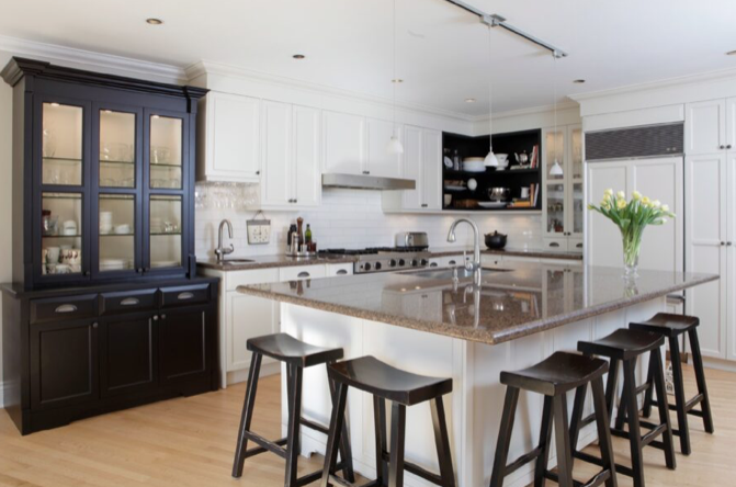
To continue our conversation regarding our most recent blog, “The Importance of Staging” I thought it’s interesting to see the before and after of a dated wooden kitchen given a painted make-over – lifting the overall look and feel of the property. See the after picture below……The biggest bonus is that the countertop no longer…
Read MoreHow to decorate in 2022
Benjamin Moore Paints have announced their colour of the year for 2022. Earlier House blogs explain how yearly trend colours are chosen. (Read here) https://housebvi.com/colour-stories-and-how-we-interpret-them-in-our-interiors/ Due to pandemic restrictions over recent years, travel became difficult, therefore virtual pin boards were used more than physical mood boards with online colour consults between decision makers. The colour…
Read MoreNew items arriving early February 2022
New finds arriving in store for February
Read MoreColour Stories and how we interpret them in our interiors.
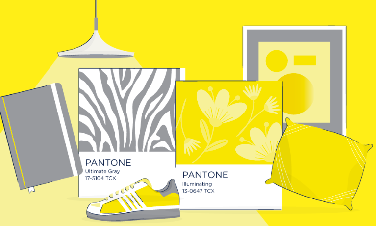
Pantone is the standardized colour matching system for identifying colours. For over ten years, The Pantone Colour Institute has issued “The Colour of the Year” as a trendsetting concept for branding, marketing and the creative society as a whole. Hundreds of brands, then take on the task of designing products using the same colour which…
Read More